The way
information is received is undoubtedly apart of rhetoric. The substance of the
medium that the message in embedded within ultimately influences an
individual’s perception of the message. When an individual's perception is
affected the rhetoric of the argument, or plain information in the case of this
post, is likewise affected. After all, rhetoric is fundamentally based on how a
person reacts to persuasion.
The
recent focus of class has been over the various aspects of visual rhetoric.
Visual argumentation, as opposed to spoken or written arguments, affects an
audience in a different while having a greater effect in some areas and a
lesser one in others. This is where the whole “the message is the medium”
philosophy comes into play. The effect that visual rhetoric has on perception
is that the argument or information presented is immediate as the audience has
a clear image of what is being presented rather than having to construct their
own image of the information that would be presented through other mediums. However,
visual rhetoric is limited in the sense that an audience is given a somewhat
surface representation of an argument which can fail to give a full
understanding.
The reason
why I have been discussing this is because of a website that I had stumbled
upon called Information is Beautiful. The website collects various forms of
data and general information and creates affecting, visual representations of
the data. My point is that the visual representation of the data is far more
effective (in my opinion) than reading informative text by itself. The information
is more accessible, understandable, and even more entertaining.
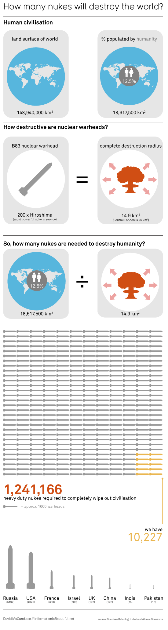
In this example of one of the visual representations, information is presented visually in an highly organized and effective way to create and implicit argument about the destructiveness of nuclear bombs. If this image was condensed to a written description, the argument would lose much of its value and directness.This is how the medium ultimately affects the message.
Although all the visual information on the site isn't argumentative, tit is is still interesting to explore how the information is affected by the medium.
informationisbeautiful.net
Gee, Connor, what a delightful visual image! Haha, I'm kidding of course (I'm really not thrilled by the idea of nuclear warfare...it's kind of depressing...) but this is a great illustration of your point. Not only are the visuals succinct and informative, they're attractive. They draw attention because they're colorful, clean-cut and achieve a good text-to-image balance. I wonder how we can incorporate these ideas into our video. Maybe we can focus on finding simple, colorful graphics to illusrate some points? We could show maps of Africa or maybe find visual representations of Kony statistics...just a thought. I don't want to stress you out, of course--just trying to stimulate the flow of ideas! I know you'll do a great job with all the tech stuff :)
ReplyDeleteIts crazy how much of a difference an image can make! If someone would have tried to explain this to me I probably would have zoned out or just gotten confused. Seeing the images shows how drastic the situation really is something that is not always successful through spoken word.
ReplyDelete